The GeoCities Era
The first specification for CSS 1 was written in 1996. Websites like GeoCities, Angelfire, and Tripod were widespread as user-generated content began to rise in popularity.
While GeoCities shut down in 2009, and many Angelfire and Tripod websites remain abandoned, it is still possible to trace the evolution of website design over the past two decades.
Earlier websites had little design, perhaps changing the font and colours, and using inline tags to make words bold, italic, or perhaps to make them move across the screen (the <marquee> and <blink> tags are notorious for being irritating products of their time).
Later on, you begin to see CSS make its appearance. It became the standard for website design in 2001. There is less focus on tables and frames being used for positioning, and a larger focus on div elements and the box layout.
View a code sample below. This shows how elements would have commonly be arranged on the page and how they would have been designed.
Here is a title.

This paragraph of text has a window either side of it.


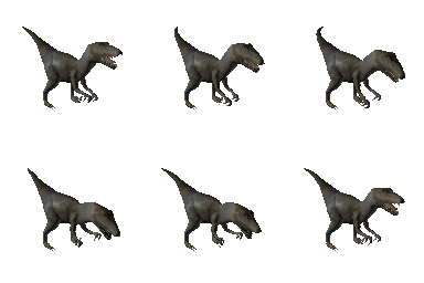
Fill this part with text. It stretches over 2 columns. Table cells allow for rigid positioning of objects. There is a T-Rex to the left of this paragraph.
<!DOCTYPE ... >
<html xmlns ... >

<head>
	<title>Title goes here</title>
</head>

<body>

<marquee style="background:#0f3" behavior="alternate"><h1>Here is a title.</h1></marquee>

<table border="1" width="100%" cellpadding="3">

<tr>
	<td> <img src="window.gif" alt="window" /> </td>

	<td width="300px" style="font-family:'century gothic';color:#f00">
		<p>This text has a window either side of it.</p>
	</td>

	<td> <img src="window.gif" alt="window" /> </td>
</tr>

<tr>
	<td colspan="3"> <img src="animateline.gif" alt="divider" /> </td>
</tr>

<tr>
	<td> <img src="rex.gif" alt="T-Rex" /> </td>

	<td colspan="2" style="background:#0f3;font-family:verdana;color:#00f">
		<p>Fill this part with text. It stretches over 2 columns. Table cells allow for rigid positioning of objects. There is a T-Rex to the left of this paragraph.</p>
	</td>
</tr>

</table>

</body>

</html>
As you can see, all of the information - the structure and the design - is bundled together. Maintenance can be extremely difficult in these circumstances as it can be hard to pinpoint problems.
What happens when the design is stripped from the structure and held elsewhere? It may look more like the following.
<!DOCTYPE ... >
<html xmlns ... >

<head>
	<title>Title goes here</title>

	<style type="text/css">
		body{
			font-family: helvetica, sans-serif;
			font-size: 16pt;
		}
		h1{
			background: #0f3;
		}
		table{
			border: 1px;
			width: 100%;
		}
		td{
			padding: 3px;
		}
		.cell-one{
			width: 300px;
			font-family: 'Century Gothic';
			color: #f00;
		}
		.cell-two{
			background-color: #0f3;
			color: #00f;
			font-family: 'Verdana';
		}
	</style>
</head>

<body>

<marquee behavior="alternate"><h1>Here is a title.</h1></marquee>

<table>
<tr>
    <td>
       <img src="window.gif" alt="window" />
    </td>

    <td class="cell-one">
        <p>This text has a window either side of it.</p>
    </td>

    <td>
       <img src="window.gif" alt="window" />
    </td>
</tr>
<tr>
    <td colspan="3">
        <img src="animateline.gif" alt="divider" />
    </td>
</tr>
<tr>
    <td>
        <img src="rex.gif" alt="T-Rex" />
    </td>

    <td colspan="2" class="cell-two">
        <p>Fill this part with text. It stretches over 2 columns. Table cells allow for rigid positioning of objects. There is a T-Rex to the left of this paragraph.</p>
    </td>
</tr>

</table>

</body>

</html>
Unfortunately, the structure is still very difficult to make sense of when everything is grouped by tables. Later on, 'div' elements would rise in popularity, and would make ordering and positioning elements a lot easier and less confusing.